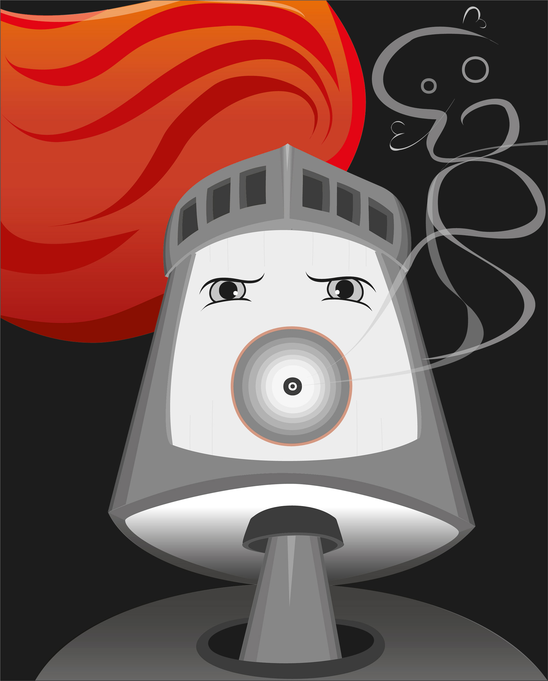
The illustration depicts a budget pest exterminator in a kid-friendly manner. The character is portrayed as a knight so that kids would not find its intent scary. Knights are represented in literature and the media as do-gooders who exterminate the bad. The murderous undertones of what a knight does are glamorised and widely accepted in children’s literature.
The ‘Spray Knight’ design is complex but achieves simplicity through the limited use of colour. The illustration uses one bold colour to lead the eyes and achieve unity and variety. The bright colour used on the plume surrounds the character's circular spray ‘mouth’ to pull viewers to that hypnotic portion. The audience's ability to decode that the mouth is a spray is improved with the emanating toxic vapours. The abstract incorporation of the skull and cross bone increases the communicative element of the smoke, thereby ensuring that the emission is seen as lethal. The ‘Spray Knight’ appears menacing, but the rounded shape of the eyes softens this harshness. What is achieved is a playful seriousness that a child can appreciate.