Spread
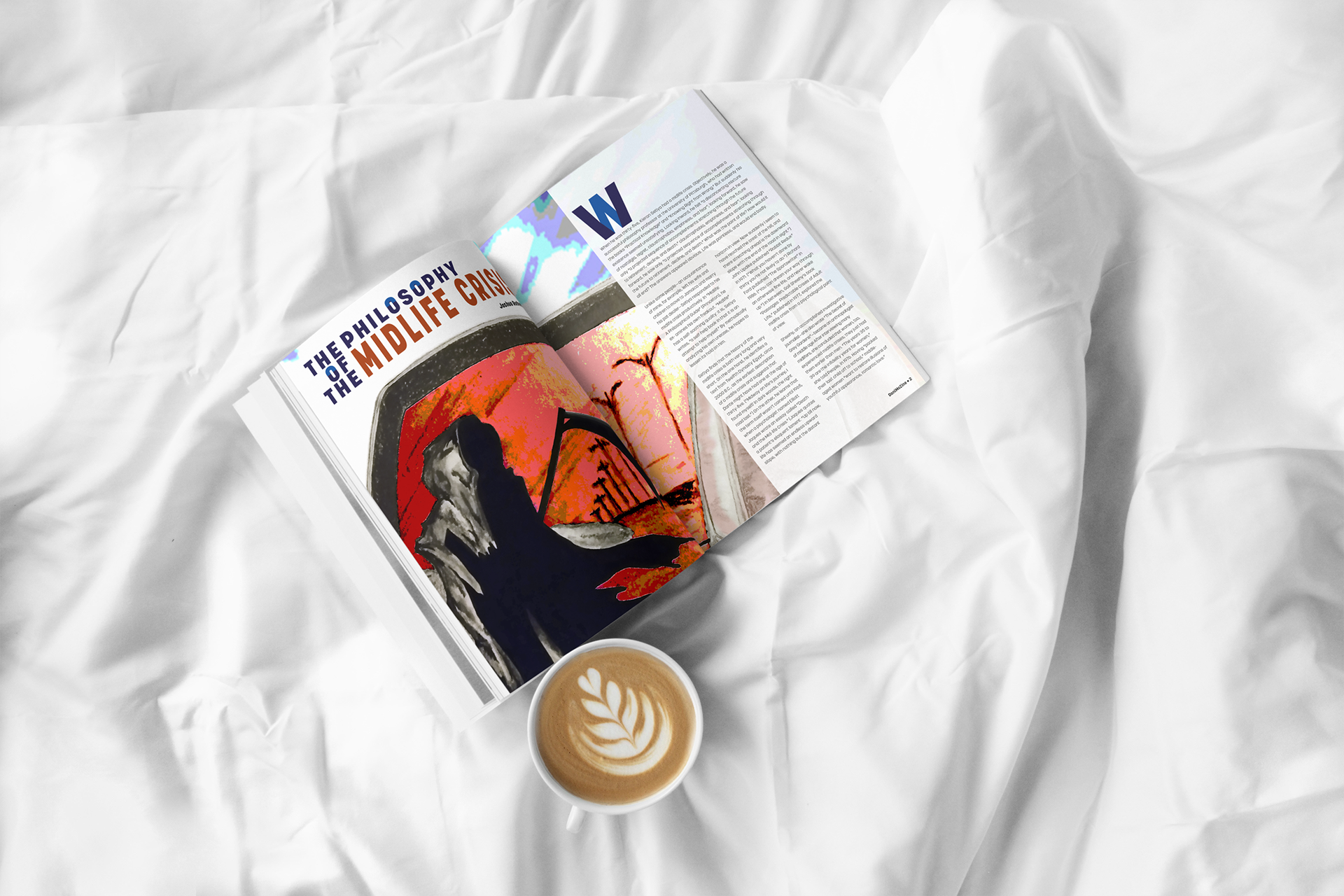
The four-page spread utilises a six-column grid. The first letter of the article is pulled out and heightened with the geometric injection of a complementary colour. Though heightened, the visual element appears subdued and, in so doing, complements the treatment given to the title of the article. The use of red in the title serves to highlight the core subject and attract readers’ attention. The colour selected for “Midlife” unifies the spread as it pulls from the red/orange featured in the illustration. The illustration dominates the landing spread with its dynamic colours and skewed placement. The skewed placement also calls attention to the subject of the illustration – the grim reaper. The illustration's skewed placement also acts as an arrow that prompts readers to notice the title.
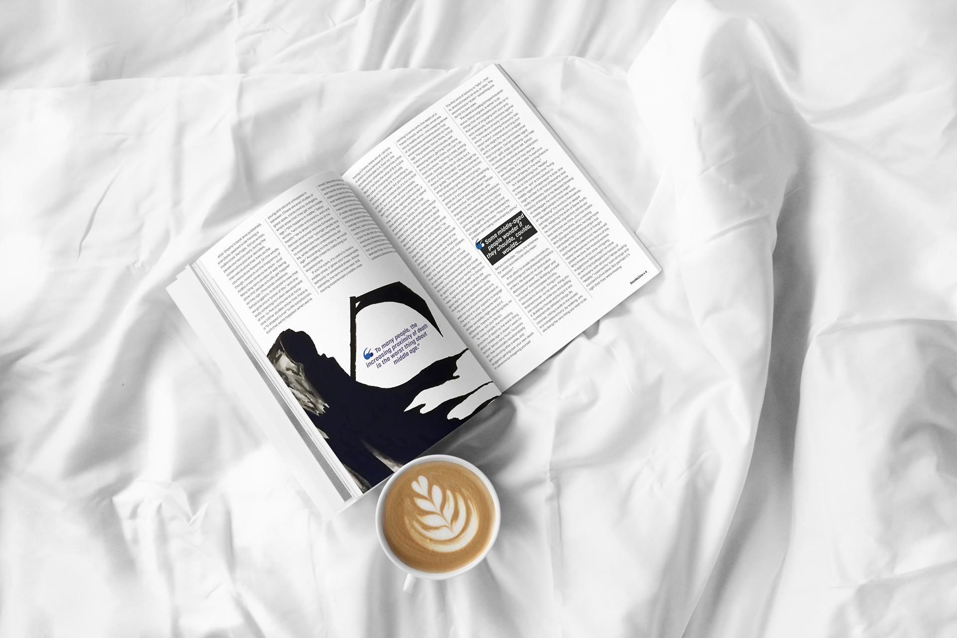
The landing page layout offers a different text arrangement from the secondary spread and pacifies the variety injected by the illustration. The absence of indentation also helps to create an implied border for the illustration. This principle of an implied border is carried over to the secondary spread where the grim reaper is boxed in by surrounding text. The use of indentation in the secondary spread pairs well with the lone subject and adds variety to a spread dominated by text.
The pull-quotes are meaningfully placed to justify the illustration used and create balance. Dividing lines are placed in the secondary spread to inject a bit of interest into the text-heavy layout. The integrity of the illustrations is preserved with the absence of footers on pages where they appear. The omission of this competing element serves to ensure that the illustration shines.
Illustration
Midlife crises occur later in life when one realises that their allotted time is winding to a close. The illustration capitalises on this viewpoint by depicting death’s approach, as seen through the car’s side mirror. The clear blue skies ahead contrast with the dark red-orange skies behind – showing the duality of mind and the clashing of emotions. The flow of death’s robe communicates movement, and the reductive detail of the figure creates mystery and communicates danger.
The roadway and the car depict one’s journey through life. The clear blue skies represent the aspiration one has for a fulfilling life devoid of impediments, and the red-orange is the unseen danger that comes along to disrupt the clear blue skies. The fact that the encroaching danger is perceivable if one takes note of the side mirror represents humanity’s ability to sense danger. However, feeling danger does not mean that it is avoidable. This sense of danger is the body and mind going into crisis mode; manic attempts are made to live a ‘fulfilling’ life, and sometimes self-destructive behaviours develop.