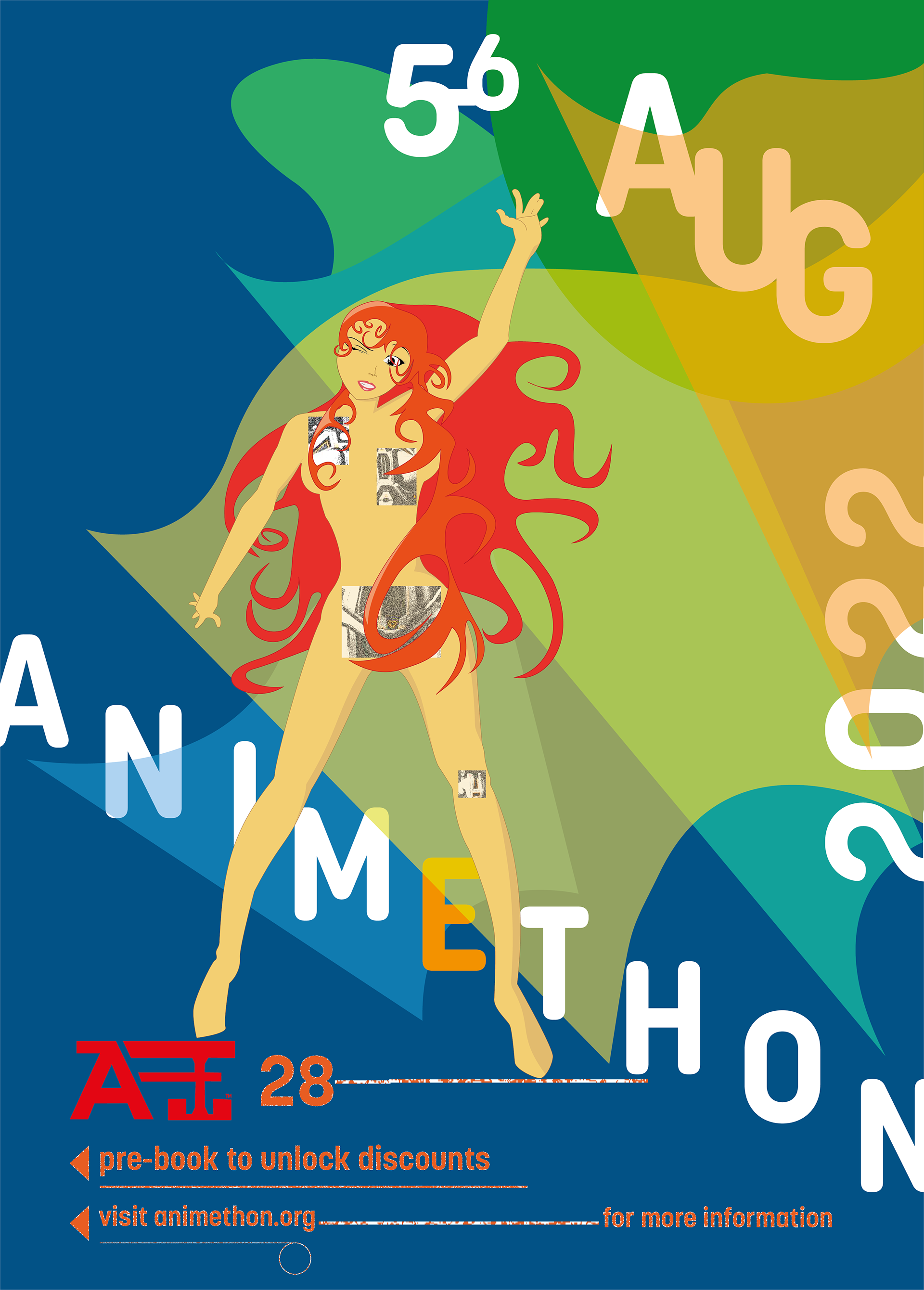
Except for the art nouveau visual reference used for the poster model’s hair, all inspiration pieces have a futuristic flair. This is in keeping with the direction of the anime industry.
April Greiman and Mucha's designs are inspirations for creating the model. The square pixelated pictures often found in Greiman's work are incorporated into the poster to craftily highlight the mechanised interior of the model. The bold hair is reminiscent of Mucha's designs and incorporates Gestalt’s principle of continuity to increase visual interest. The model’s hands are pointing upwards and downwards to hint at the directional flow of the type.
The typography has a playful layout that is suitable for an anime-themed festival. Also, the bright background provides a rhythmic punch of colour that leads the reader’s eyes; in the same way, the model’s hands call attention to the important additional information below. The typography layout helps the poster achieve visual hierarchy, allowing the most important information to shine while ensuring enough visual interest is present to make the smaller print noticeable.
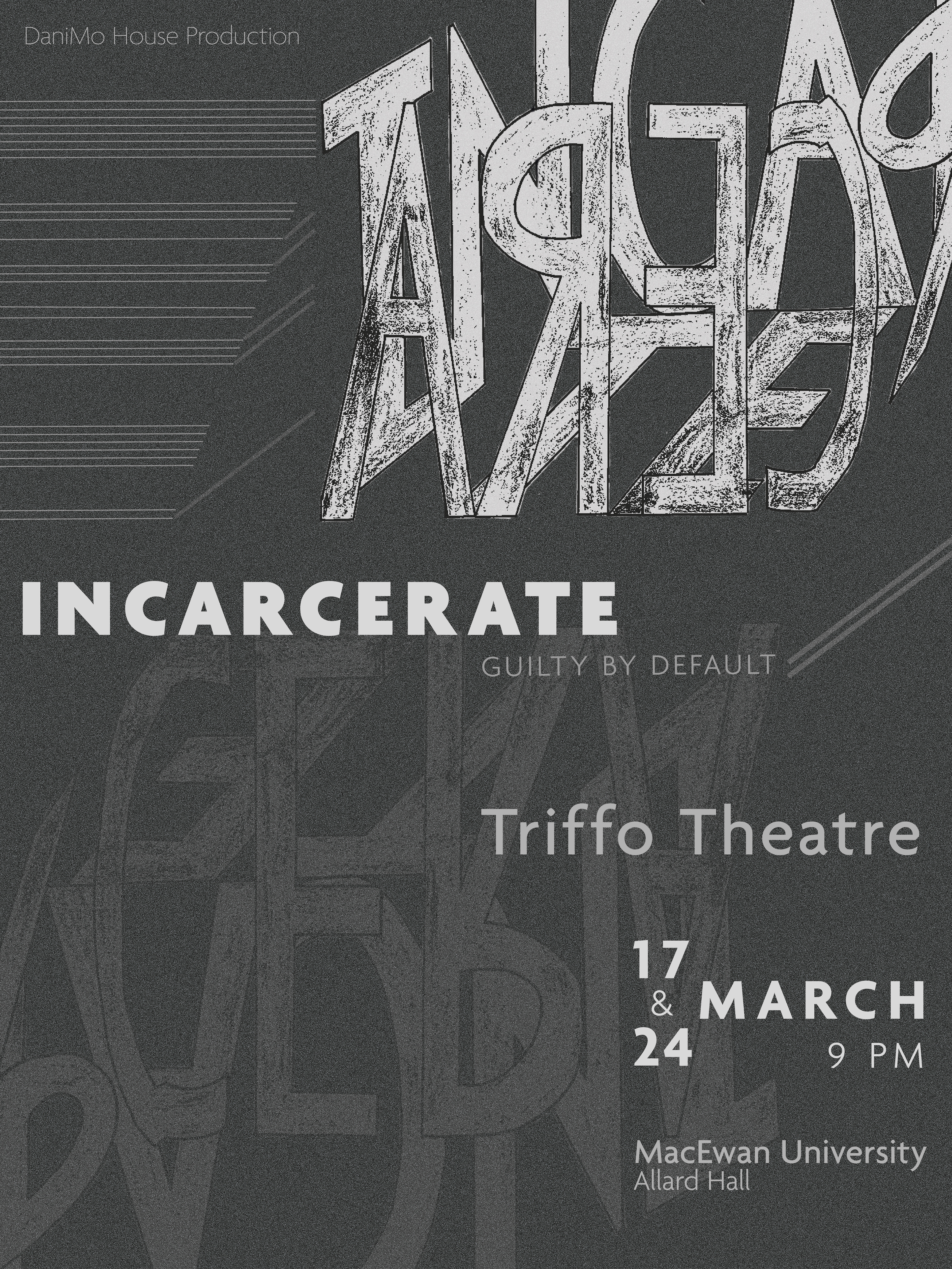
The poster utilises a muted colour palette that accentuates the title. The visually rough background adds another layer of texture that increases the communicative elements of the title. Hierarchy is achieved with word size, placement, use of uppercase and lowercase letters, and intensity of the primary colour. The grouping of location information makes it easy to read that information as one and is another occasion where hierarchy is used to highlight the most important information from that grouping.
The poster's title has a raw, hand-crafted appearance that compliments its expressive layout. The inversion and reduced intensity of the title at the lower-left add variety and help pull the viewer’s eyes to the important details at the bottom right.
The title is written in the shape of a box that suggests confinement or restriction. The boxed title bleeds off the page and utilises Gestalt’s principle of continuity to suggest that the issue is larger than the eye can perceive. The use of the box to shape the word makes it difficult to determine the starting point. However, this problem was solved with the repetitive use of lines of decreasing lengths that create an abstract arrow pointing towards the letter ‘I’. Other legibility issues are resolved by repeating the title in the poster in an uninteresting and bold typeface.
The unique placement of the date adds interest to the lower half of the poster, thereby creating an asymmetrical balance. The theatre's name is separated from the other location information to add interest and force the eyes to view the poster as a whole instead of concentrating on one or two areas of interest.