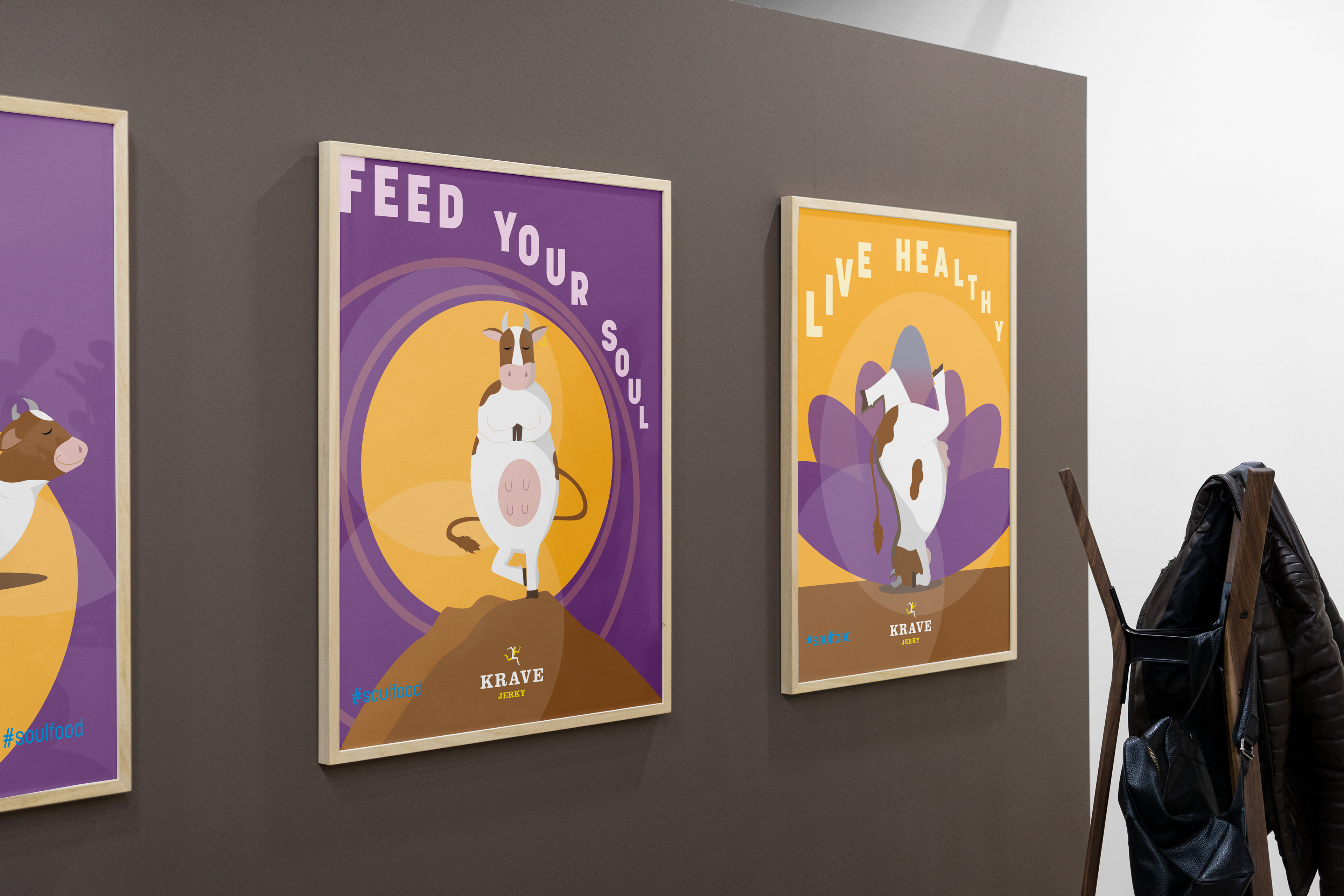
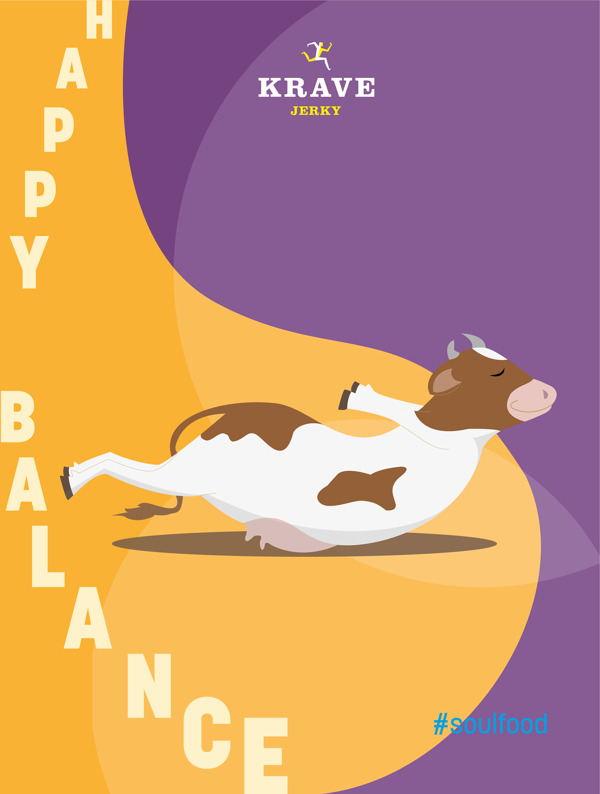
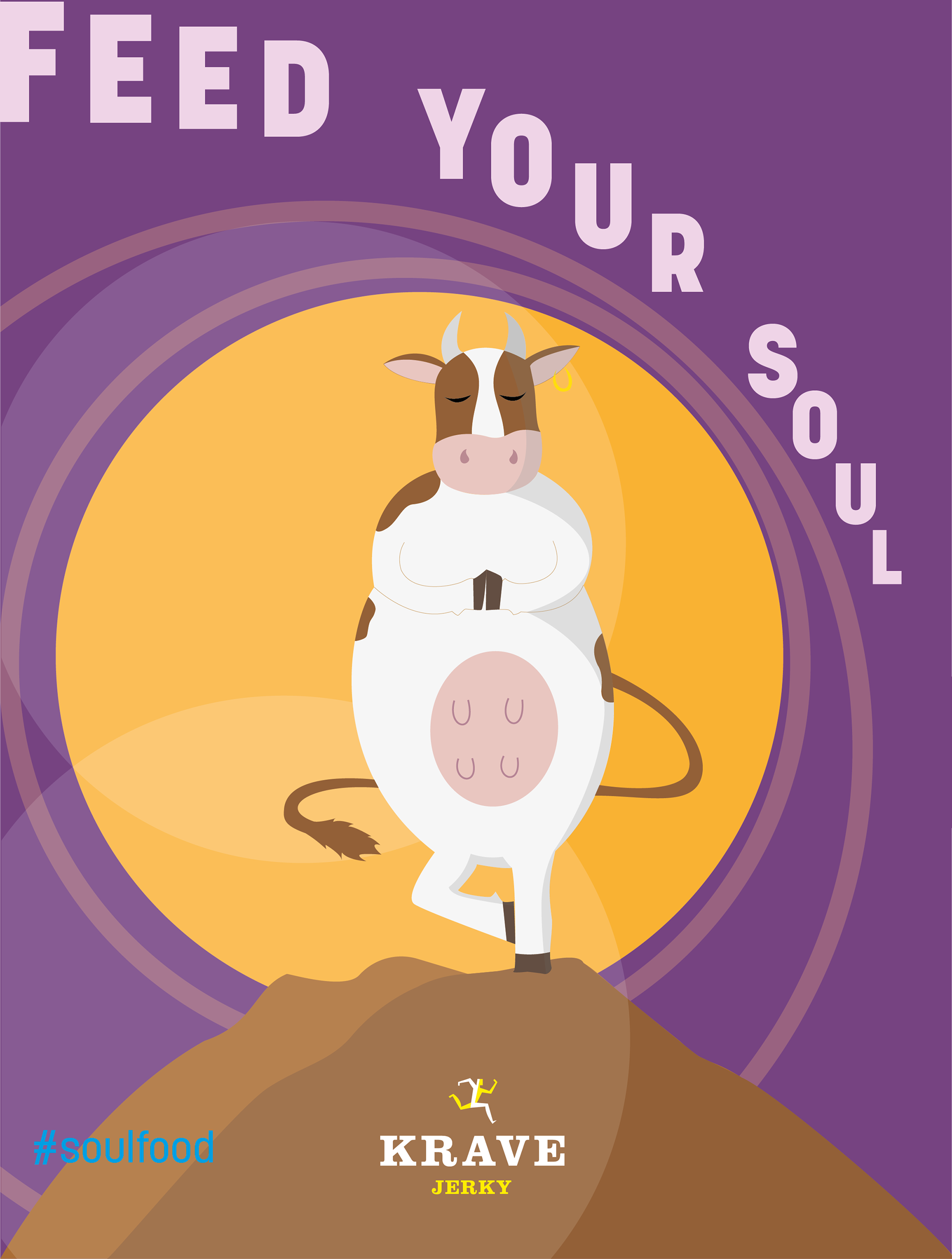
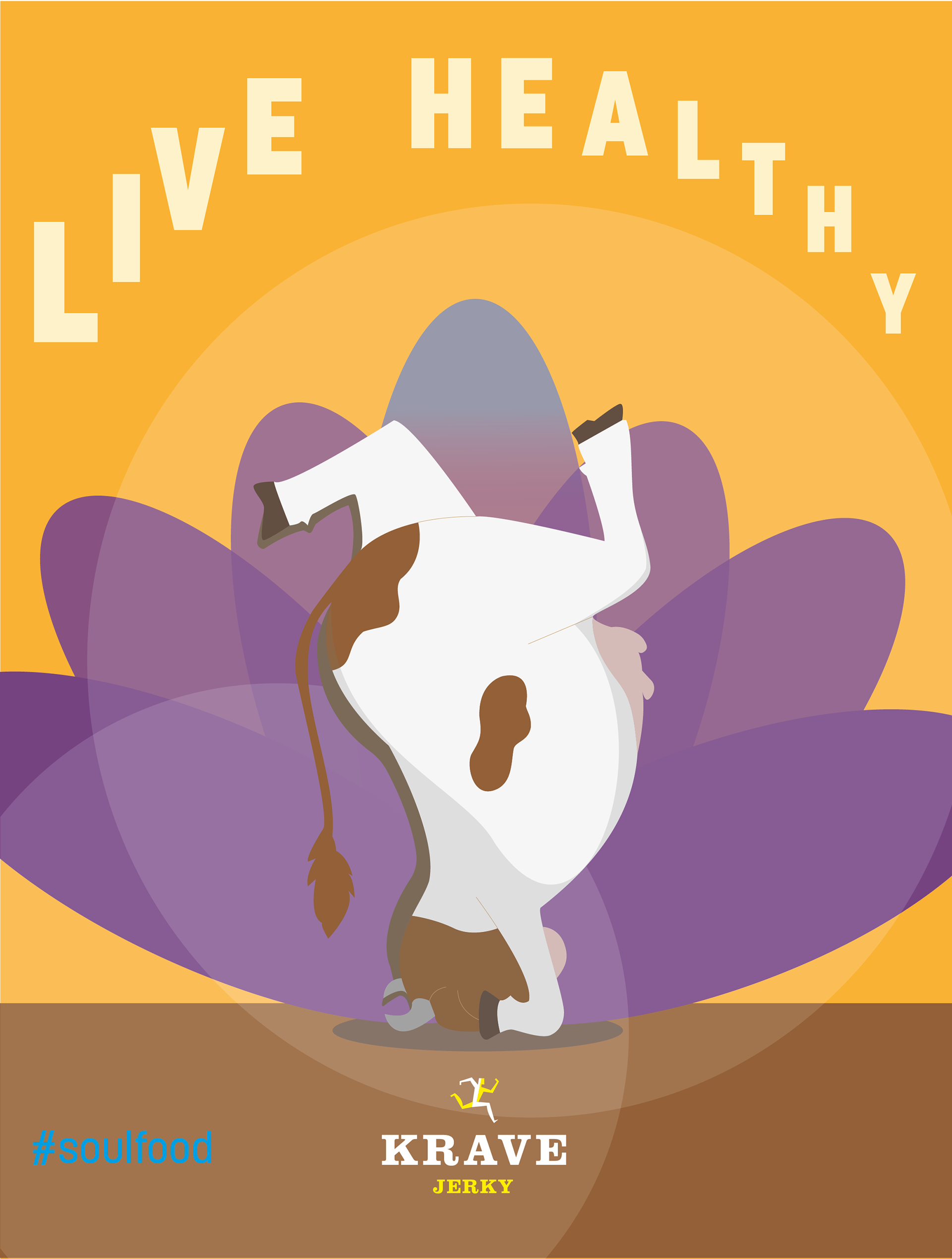
The advertising illustrations achieve coherence by using a single subject in varied yoga poses. The personification of the cow enhances the viewer’s ability to decode the message being conveyed by the serene, health-conscious, but humorous cow; KRAVE Jerky puts your health first and only uses the best beef (the most popular meat used for jerky). Unity is also achieved in the illustrations with the repetition of the high contrast rich earth tones; the consistent decreasing size of the typeface used; the blue of the hashtag; the placement of the KRAVE Jerky logo in the centre of the design and the colours used in that logo, and the translucent circular background detail.
Each catchphrase is curved to lead the viewer's eyes towards the other details on the poster;however, variety is achieved with the unique curve of the typeface to accentuate the cow’s changing yoga poses. The background used in each poster is varied, but all three have yoga influences. The circular detail in poster one symbolises harmony and unification of the mind, body, and soul; the abstract lotus flower symbolises spiritual awakening and hope, and the abstract yin yang motif included in poster three represents balance. Each symbol appears to
complement the central message of each poster.
complement the central message of each poster.
Hierarchy is achieved through colour, placement, weight, and size. The catchphrases take the lighter colour of the background it is placed on and, in so doing, stop the larger typeface from dominating the illustration and competing with the cow. The KRAVE logo, though smaller, achieves prominence through its placement at the centre. The hashtag is coloured in an eye-catching blue that allows it to be noticeable despite having the smallest presence. The rendering of the illustration in vector imaging gives it a clean, professional look. This output may be suitable for online and television marketing. The relatable cow and hashtag will lend to an effective cult marketing strategy.